Sweat and Tonic
Brand Strategy, Identity Design
Helped launch a powerful wellness brand.

Built a thriving fitness community from the ground up.
Ray Oldenburg’s “third place” philosophy describes social environments separate from home and work. While coffee shops traditionally fill this role, we saw an opportunity to reimagine the gym as a community-centred third place.
We built Sweat and Tonic from the ground up: a downtown Toronto fitness hub combining three workout disciplines with social networking and lounge spaces. Starting with brand strategy, we developed a complete identity design, environmental design, and website—all unified by the third place concept.
This strategic foundation drove every decision, from partner selection to trainer recruitment. Central to third places are “The Regulars” who set the tone and welcome newcomers. We built this community by recruiting top trainers as brand ambassadors during construction, creating an established network from day one.
The result: a comprehensive brand system that served as a launchpad, enabling rapid market establishment and laying the groundwork for expansion.

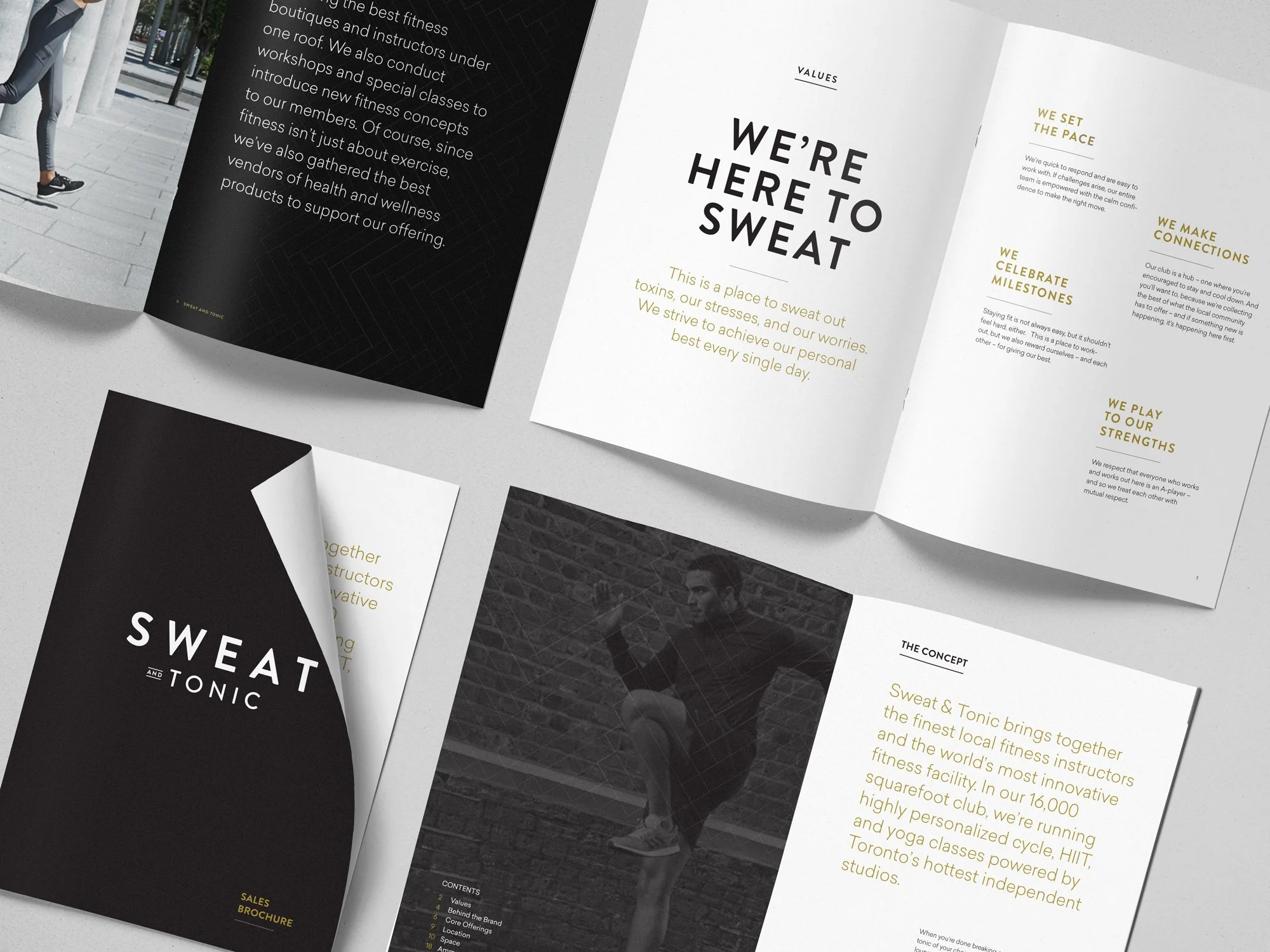

The third place concept became our strategic filter, transforming how we built community through fitness.



We’ve packaged what we’ve learned over the last 21 years of branding into a monthly newsletter. Join our mailing list for fresh ideas, client field notes, and internet gems.