Hope Place Centres
Brand Strategy, Identity Design, Web Design


Helped develop a strategy that aligned the board, staff and stakeholders.

Hope renewed, results delivered.
Hope Place Centres faced a critical challenge that plagues many evolving organizations: their progressive approach to addiction treatment wasn’t reflected in public perception. Despite modernizing their treatment modalities and combining trauma-informed care with lived experience expertise, the gender-specific recovery center was still viewed as rigid and inaccessible to community needs.
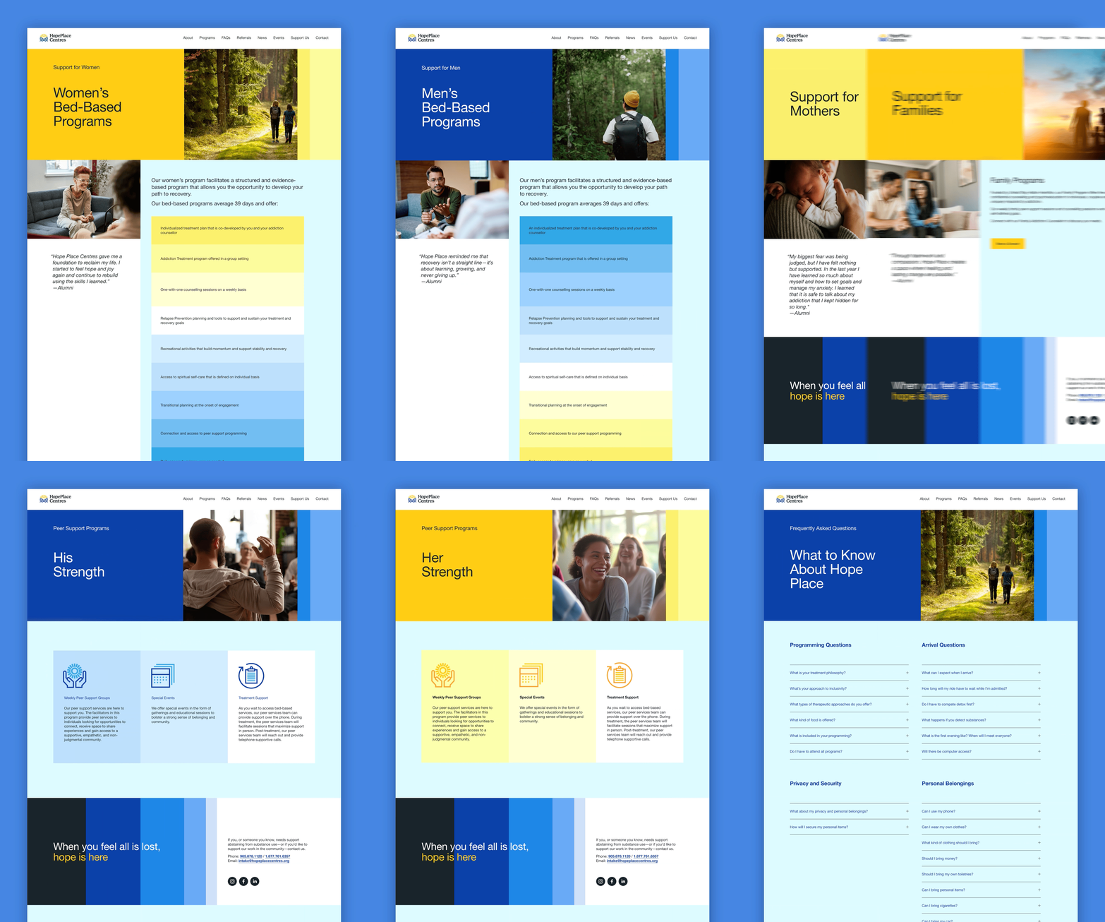
Parcel’s comprehensive stakeholder audit revealed this disconnect between reality and perception. The solution required more than cosmetic changes – it demanded a complete narrative transformation. Through strategic rebranding including a new logo and website redesign, Parcel repositioned Hope Place Centres within the broader mental health and addictions treatment continuum, emphasizing partnership rather than isolation.
The rebrand successfully communicated the center’s evolved identity as a flexible, collaborative partner in sustainable recovery. This authentic storytelling approach has yielded tangible results, with improved fundraising outcomes and more successful grant applications—proving that when organizations align their external messaging with their internal evolution, stakeholders respond with increased confidence and support.
Parcel helped us bridge the gap between who we had become and how we were seen. The rebrand authentically represents our trauma-informed, collaborative approach while honoring our mission of sustainable recovery.
Amy Wilson, CEO

We’ve packaged what we’ve learned over the last 21 years of branding into a monthly newsletter. Join our mailing list for fresh ideas, client field notes, and internet gems.