Coco Reformer Pilates
Brand Strategy, Identity Design, Environmental Design, Digital Design
Made to feel like a welcome.
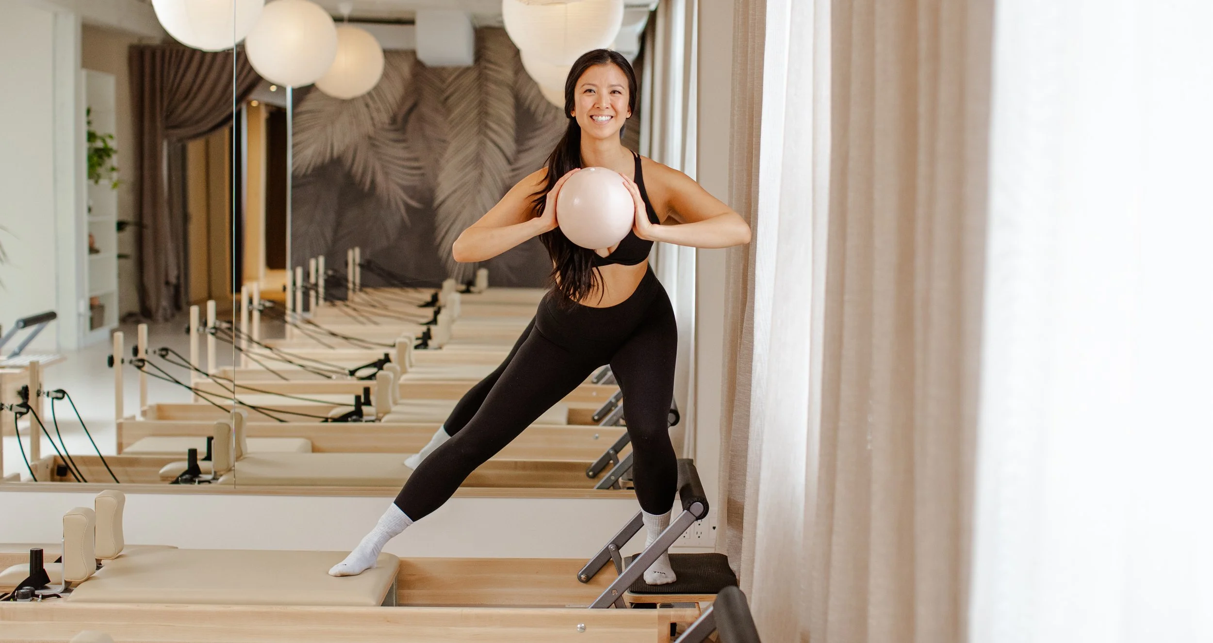

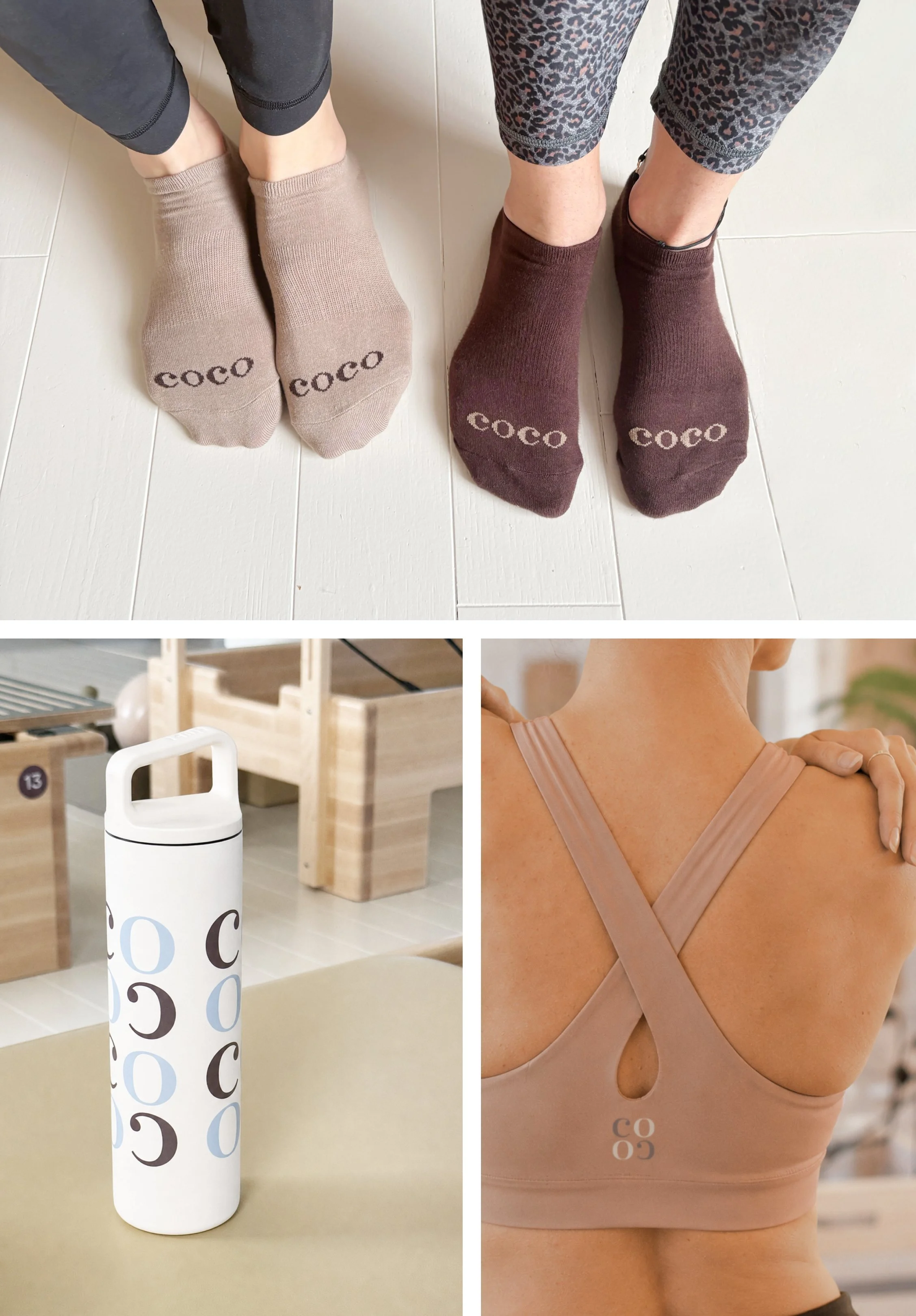
We built Coco from its name out – a mark always in motion, and a welcome you can feel everywhere from the logo to the socks on the studio floor.
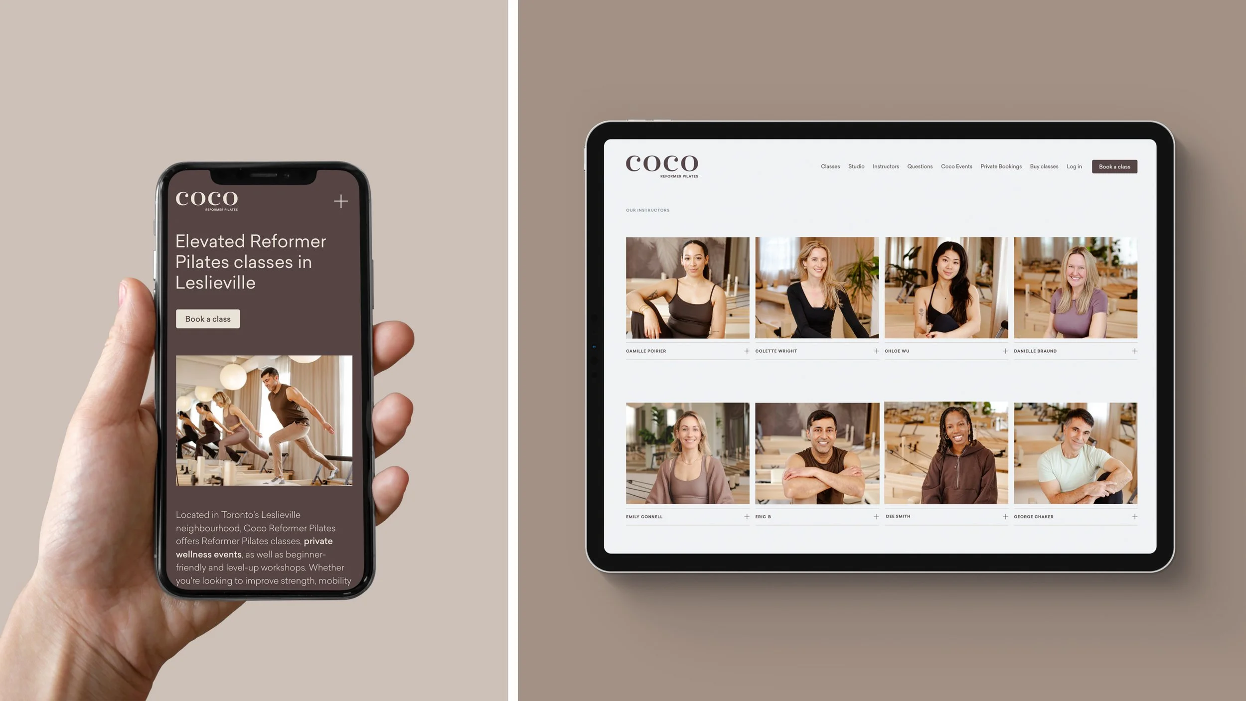
Helped a new studio launch to a sold-out first week.
Pilates was booming, and in Leslieville alone a cluster of new reformer studios were preparing to open within months of each other. Underneath the boom sat a quieter truth: for every person drawn to the practice, another was put off by it – by the machines, the performance culture, the sense that everyone in the room was already fluent. Most studios spoke to the converted. Coco's opening was everyone still standing at the door.
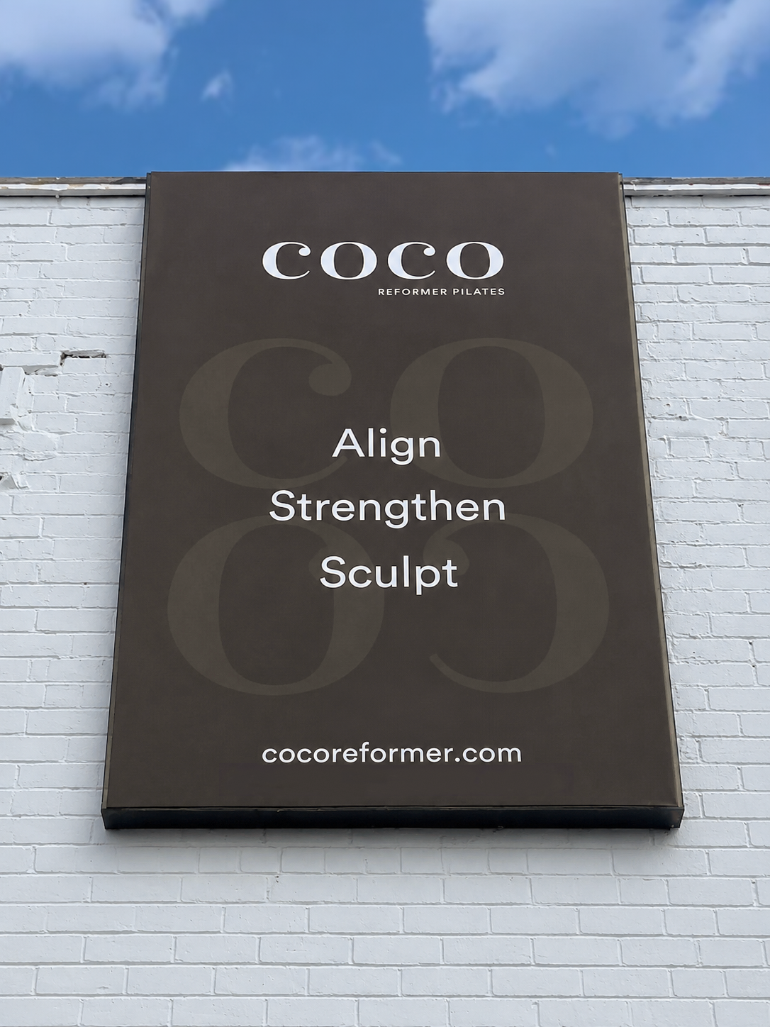
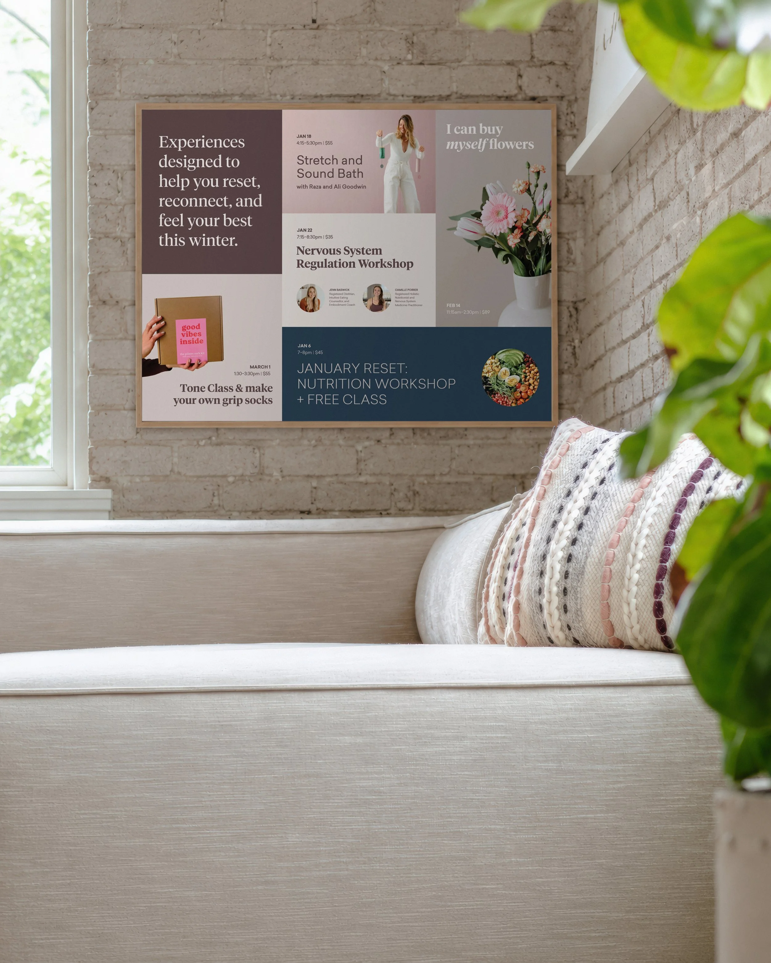
We built Coco from its name out. Chosen by the client for its warmth and whimsy, “Coco” is short, symmetrical and made to be played with – so we drew letterforms that interlock forwards and backwards, forming a pattern that keeps shifting yet stays instantly recognizable. It reads as motion, quietly echoing the practice itself. From that mark we developed the full system – identity, environmental design, wayfinding, merch and a website that wrapped Coco’s third-party booking into a single on-brand flow.
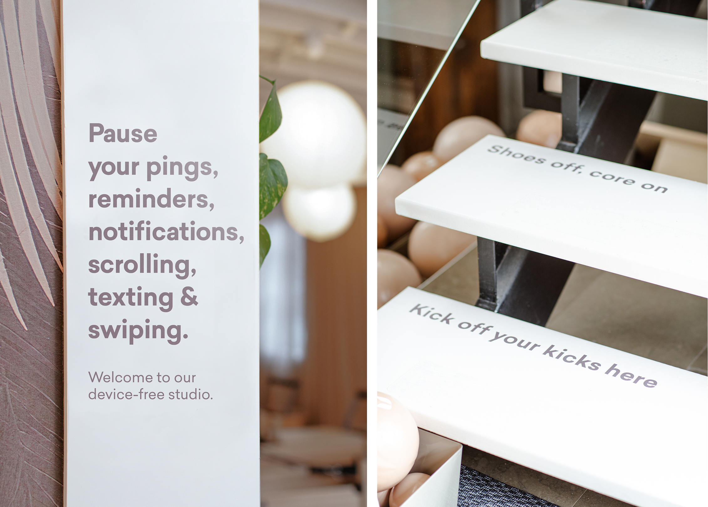
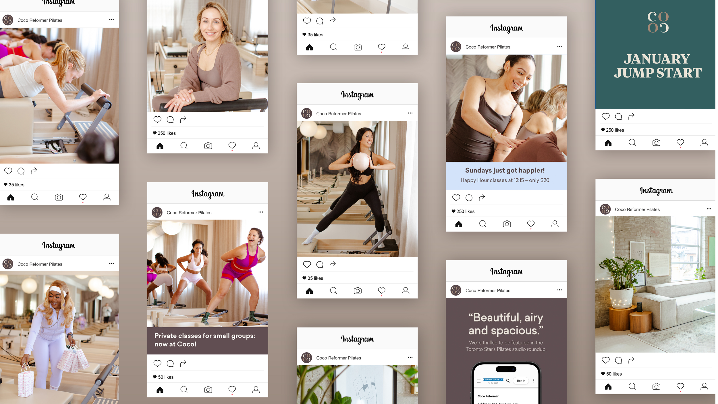
Warmth had to be more than a word. A grounding brown, lifted by airy lavenders and blues, kept the brand calm rather than clinical. We shot Coco’s real team and members with fitness photographer Jay Crews – real bodies and real people in place of aspirational models. Even the wayfinding carried the tone, from “Shoes off, core on” to the device-free studio’s “Pause your pings.” And the whole platform was built so Coco’s own team could keep making brand-aligned content long after we left the room.
The result: a presale of media events, organic social and digital advertising that sold out launch week and hit the studio's opening targets. The Toronto Star featured Coco in its roundup of the city’s studios. A year on, the clearest proof is a sighting – Coco socks and water bottles turning up at studios across the GTA, worn by members who choose to represent the brand unprompted. The welcoming one, it turns out, travels.


We’ve packaged what we’ve learned over the last 21 years of branding into a monthly newsletter. Join our mailing list for fresh ideas, client field notes, and internet gems.