Identity, Campaign materials
Children’s Aid Foundation of Canada – Teddy Bear Fund
Helped a 60-year-old brand rediscover its story


A small symbol. A long horizon.
Children’s Aid Foundation of Canada launched the Teddy Bear Fund a decade ago – an endowment program inviting major donors to commit a minimum of $100,000 to a non-restricted pool supporting children and youth in vulnerable situations. The brand needed to do two things at once: feel elegant enough for sophisticated funders and emotional enough to honour what the gift was for.
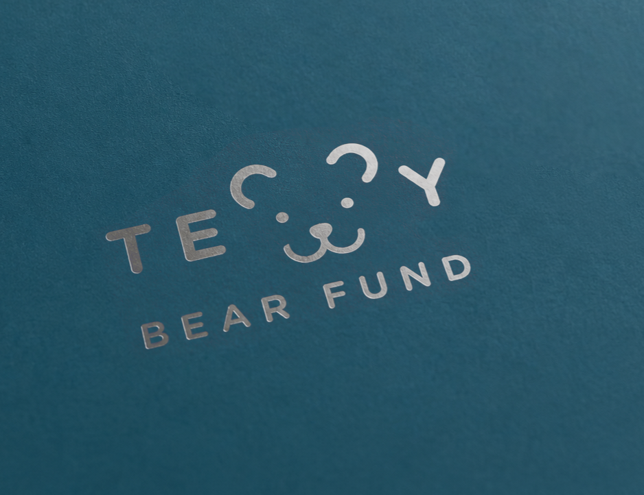
Parcel designed a symbolic teddy bear icon paired with a clean wordmark – built to function as a stamp across fundraising materials, resonate at small sizes and read instantly whether it appeared on a thank-you card or a donor wall.
“Ten years on, the symbol still held.
The language had to grow.”
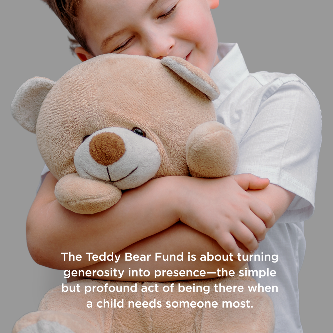
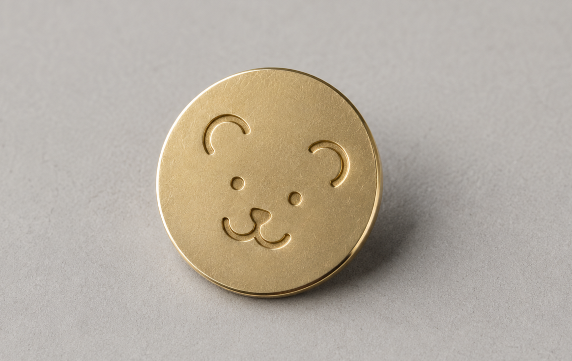
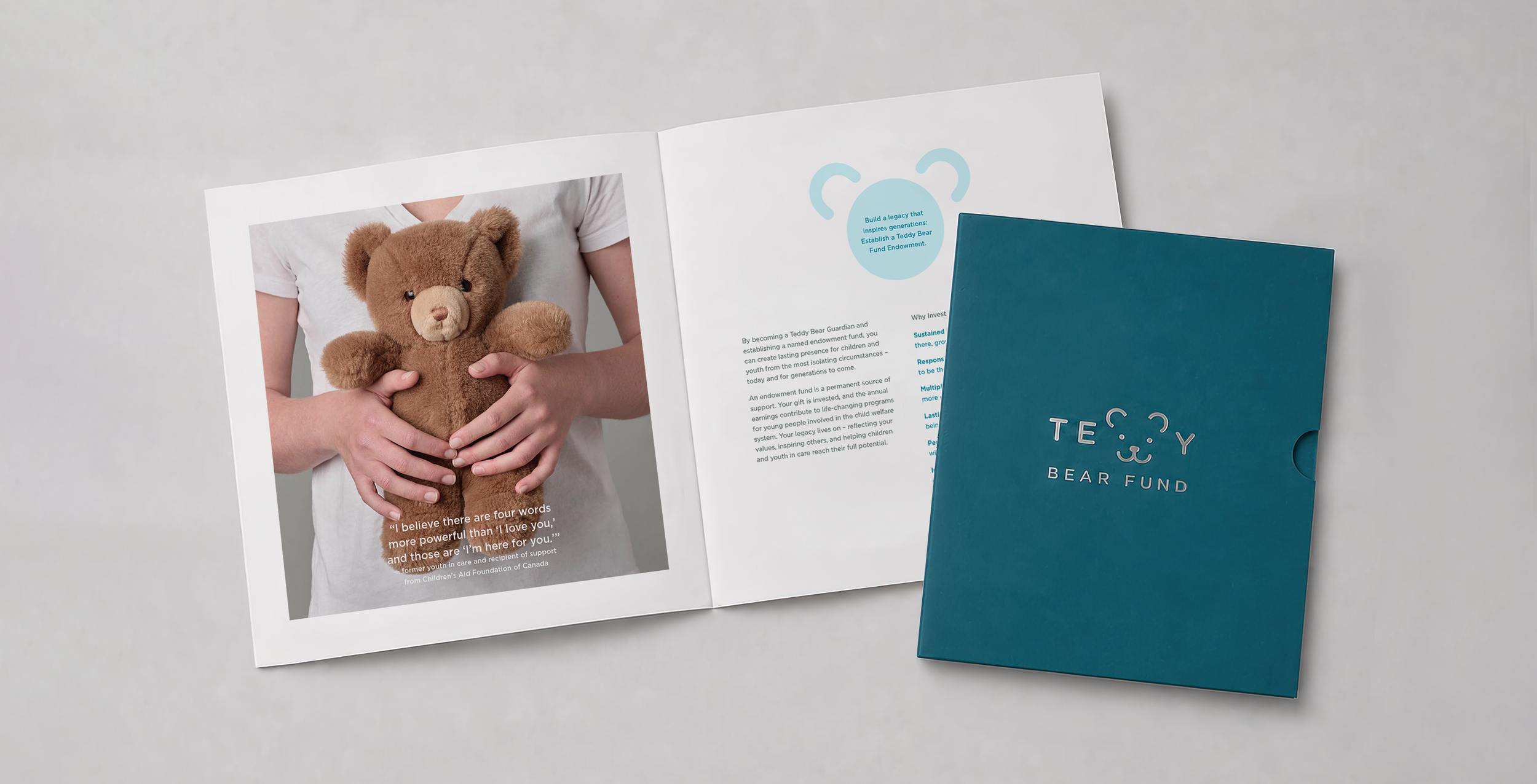
A decade later, the Foundation returned. The Fund had grown into a pillar of CAFC’s strategic plan, now granting $1.375 million annually to 18 programs run by the Children’s Aid Society of Toronto and Native Child and Family Services of Toronto. The logo didn't need to change – the language around it did. Parcel refreshed the brand story, built a new presentation package for major-gift conversations, designed a custom donor pin produced by Toronto jeweller Suetables and commissioned original photography with Arash Moallemi at FUZE Reps – children and youth holding teddy bears, framed to land the symbol at the heart of the pitch.

We’ve packaged what we’ve learned over the last 21 years of branding into a monthly newsletter. Join our mailing list for fresh ideas, client field notes, and internet gems.